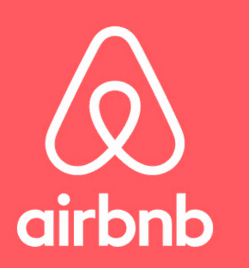
Ever since Airbnb unveiled their new logo, they’ve been the butt (or balls, if you prefer) of jokes. Apparently, everyone on the Internet has their mind in the gutter when they look at Airbnb’s logo. And Airbnb likely wants it no other way. After all, what’s some innocuous teasing when you could really be punched in the gut by negative PR, given the recent ire toward housing issues potentially caused by Airbnb, or the lack of support when renters have squatters, or the ongoing legislative battle.

Airbnb’s logo laughter couldn’t have come at a better time for the thriving company that propelled the not-quite-accurate “sharing economy” label into popular lexicon. If you’re going to choose between hit pieces, you’d rather have TechCrunch call your logo a female anatomy than have Valleywag write about how you abandoned a beleaguered renter in her legal battles.
Of course, not all toilet-minded logos work out. The University of California faced similar jokes but far more rancor when they revealed a new branding mark that was so negatively received, they changed course and reversed their decision. And what happens when you revamp your logo but no one cares? Such was the case with Yahoo!’s logo tweaks. Airbnb’s logo falls into neither category; instead, taking much of the focus away from its recent difficult press and into something lighter and fluffier, which couldn’t have worked out better for Airbnb, despite spokespeople claiming to be butt-hurt about it. Sometimes, it’s not so bad being the butt of jokes.